How to Make a Sunburst Chart in Tableau
A sunburst chart is like a pie chart with layers. It helps you show a lot of related data in a clear and colorful way. We can create it with the help of map layers, for that we need to generate dummy points in the map.
Let’s get started with our steps:
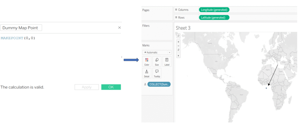
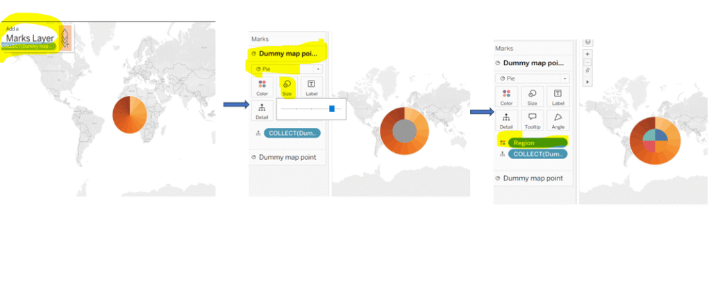
Step 1: To generate dummy points on the map, create a calculated field (dummy map point) using makepoint (0,0) formula, now double-click on the newly created field, Tableau will automatically place Longitude and Latitude in columns and rows shelves and show a dot on the map.
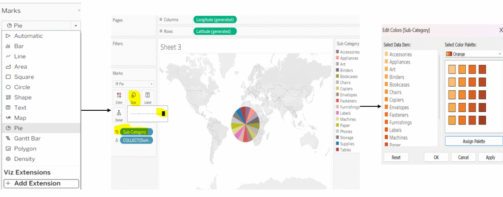
Step 2: Go to the marks card and change the type from map to pie. Place sub-category on to the color in the marks card and increase the size of the pie for better visibility, you can edit its color according to your requirement by clicking on to the color marks card.
Step3: Now, place the calculated field (dummy map point) on the map layer, change the chart type to pie, resize it to create a hole in the middle, and add region to the color.
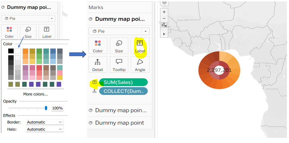
Step 4: Drag the same calculated (Dummy Map Point) field to the map layer again and repeat the steps. For the innermost center layer, choose a white color so it looks like the center of a sunburst chart, and add Sales to the Text on the Marks card.
Step 5: Go to the Fit menu and select the entire view to ensure the chart occupies the full space. If it does not cover the entire area, press Ctrl+Shift+B to increase the size of the sunburst chart. Next, go to the menu and set the map background to None. Open the format pane and remove any unnecessary lines or borders. If headers appear on the left or bottom of the chart, right-click on them and select Hide Header.
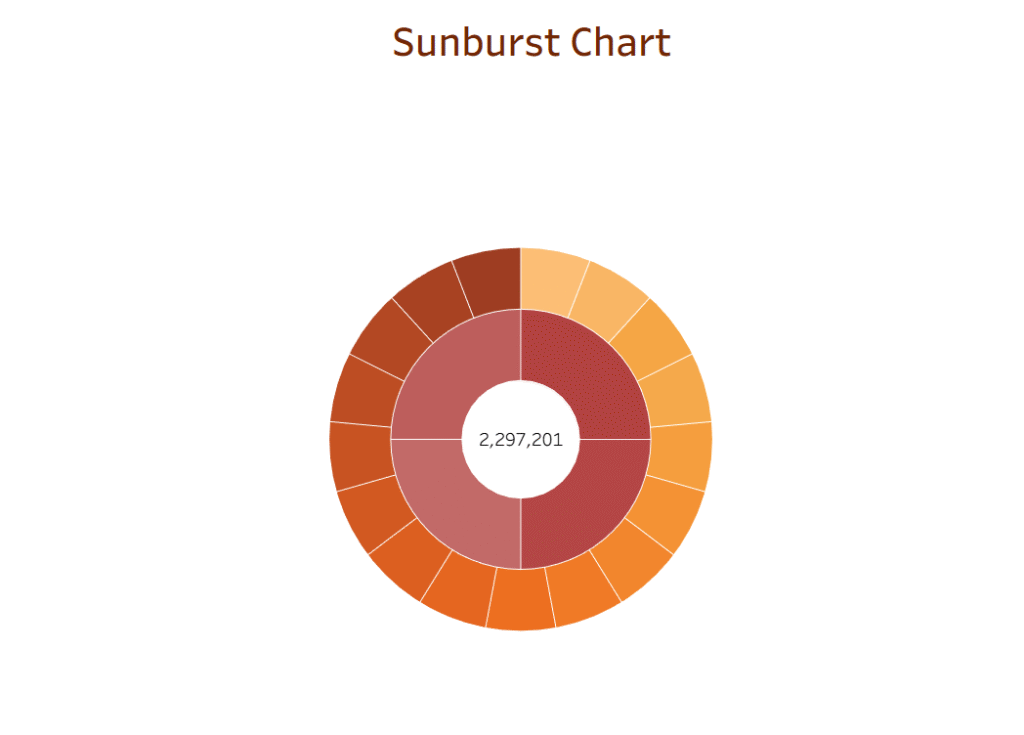
Now your sunburst chart is ready.
Keep Learning!
Thanks for supporting me.