Donut Chart in Tableau:
The donut chart is similar to a pie chart but it has a blank space in the middle which makes it look like a donut. It is used to compare individual values to the total. Blank space in the middle could be utilized to represent the total sales and the surrounding segments to represent region-wise sales, showing how each region contributes to the overall Sales.
Let’s get started with our steps to create a donut chart:
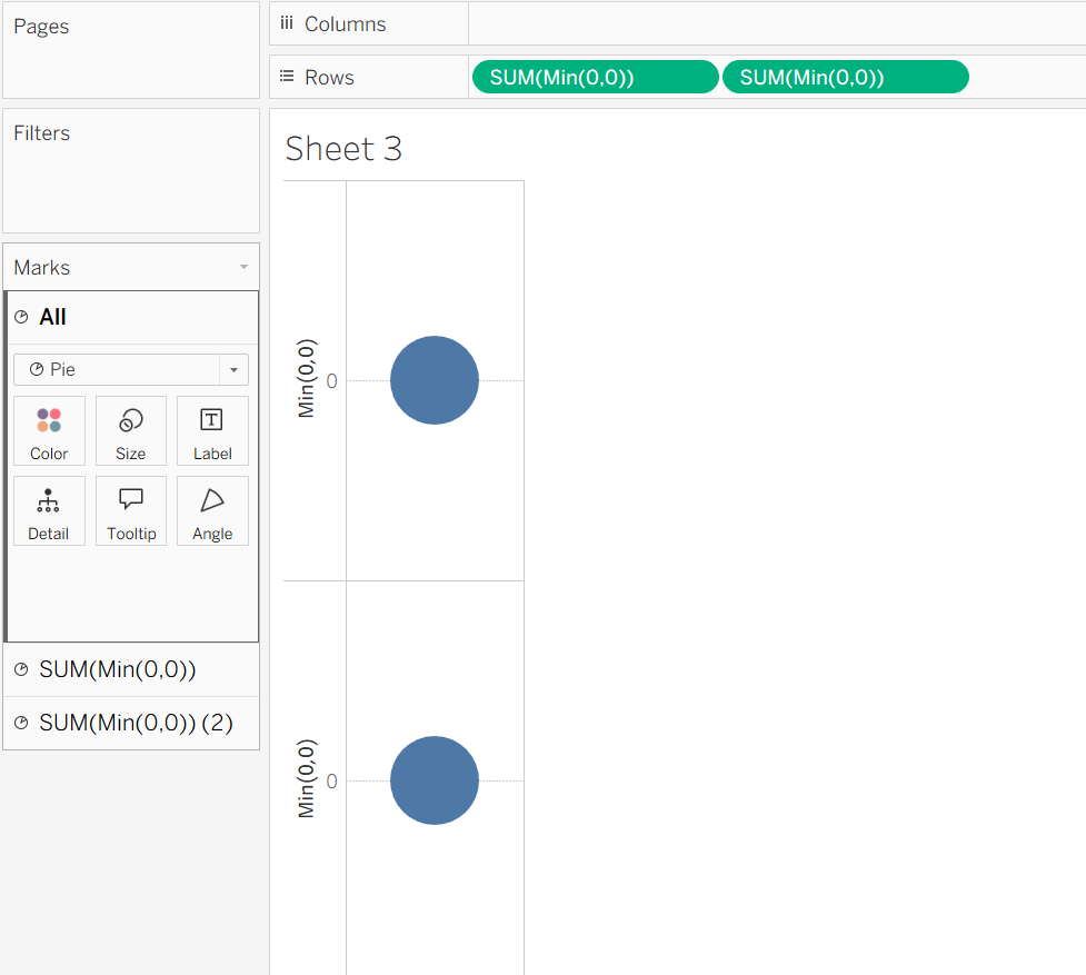
Step 1: After connecting to your dataset, go to the rows shelf and double-click on an empty space. Then, create a dummy calculation using MIN(0,0). Repeat the same step to create it again.
Step 2: In the marks card, click on the dropdown and choose Pie chart type.
Step 3: To combine the two dots, click on the second dummy field’s dropdown and choose Dual-Axis from the given options, now go to the fit and make it fit the entire view.
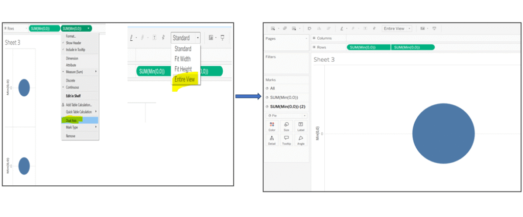
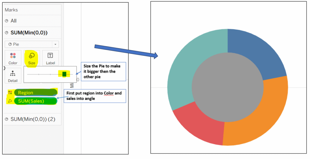
Step 4: For attaining the donut chart shape, place Dimension (region) on color and Measure (sales) on angle for the first pie chart, then click on the size and make it bigger so that it appears on top of the second chart. After completing these steps, you will notice, it starts to look like a donut.
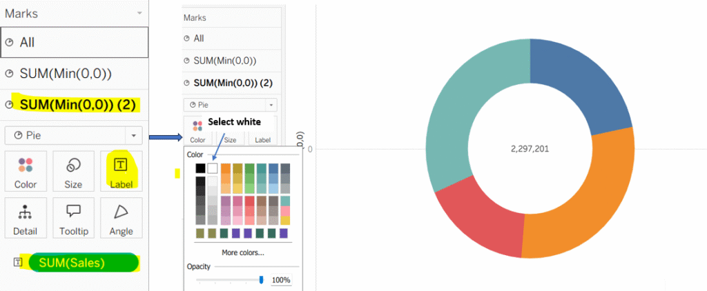
Step 5: Click on the second field (sum(Min(0,0) (2)) in the marks card and place sales on label in the marks card. Change the color of the inner pie chart to white. This creates the donut effect by masking the center of the chart empty.
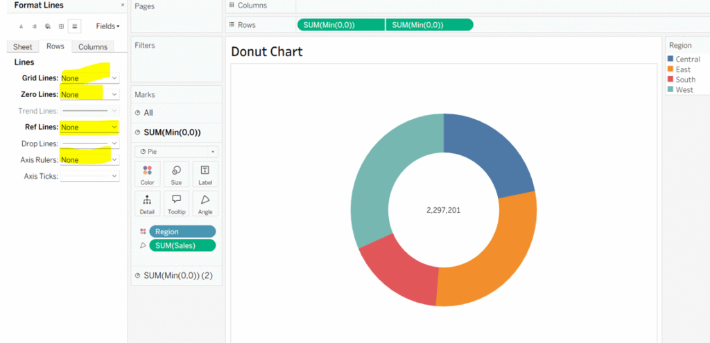
Step 4: Final Formatting
- Open the Format Pane and remove any unnecessary lines or borders.
- If headers appear on the left or right side of the chart, you can hide them by right-clicking and choosing Hide Header.
Your donut chart is ready!🍩
Thanks for supporting!
Keep Learning.