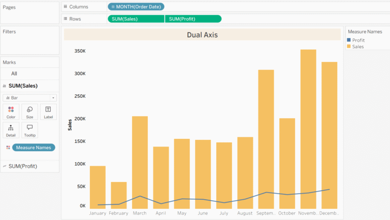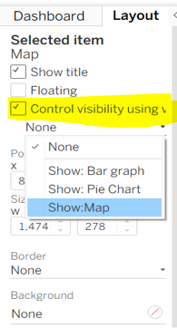
Animation in Tableau:
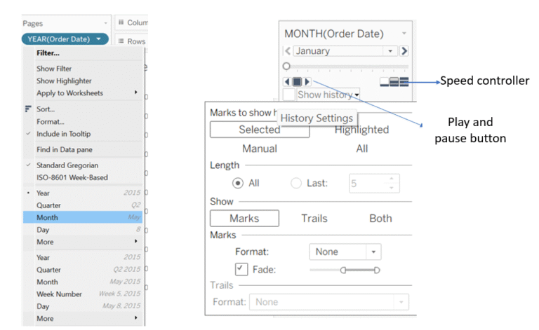
Animation in tableau is used to show the motion in your visualization over a period of time, it is useful in storytelling and trend analysis. It Improves clarity and helps the eye to follow changes and it engages viewers which makes dashboards more interactive and compelling. You can use animation in two ways: 1. Pages…