Animation in Tableau:
Animation in tableau is used to show the motion in your visualization over a period of time, it is useful in storytelling and trend analysis. It Improves clarity and helps the eye to follow changes and it engages viewers which makes dashboards more interactive and compelling.
You can use animation in two ways:
1. Pages Shelf Animation: This method involves creating a series of discrete pages for your visualization, where each page represents a different view of the data.
2. Viz Animation (Mark Transitions): This is a built-in feature that adds motion to your data marks as they change in response to interactions with filters, sorts, and parameter changes.
Let’s get started with incorporating animation into your dashboard.
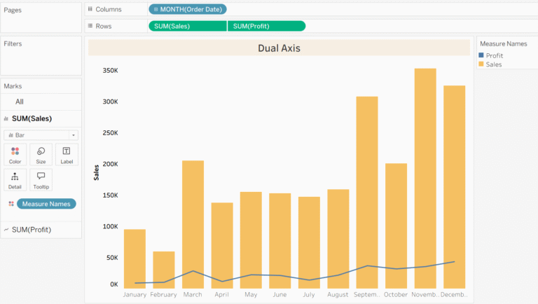
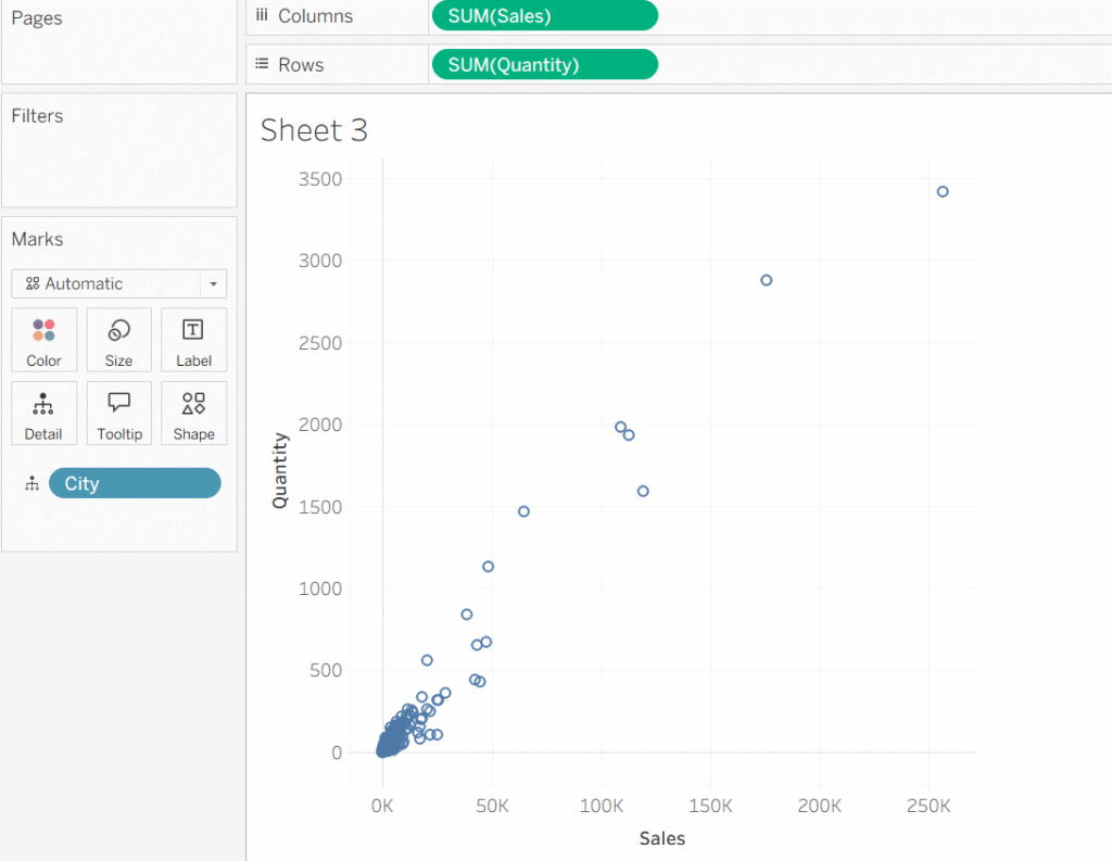
Step 1: Add sales to the columns shelf and quantity to the rows shelf. Since we want data points by city in our scatterplot, drag the city on to the details in the marks card.
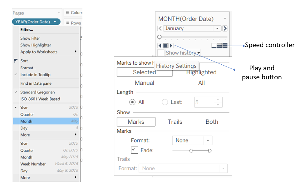
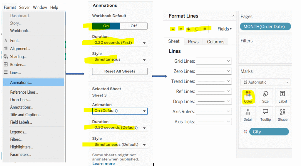
Step 2: Since we want monthly flow of data points in our view, drag order date to the pages shelf, then from the order date dropdown select month. As soon as you put order date on pages shelf, you will notice on the top right corner animation controller would appear. This allows you to play, pause, and control the history setting.
Step 3: Drag city to the color shelf in the marks card, and then do a bit of formatting. Click on format and select ‘Animation’. A formatting pane will appear on the left side of your tableau screen and use the dropdown options to adjust the animation settings according to your needs. Again, click on format and you’ll find additional formatting options on the left. From there, remove any unnecessary gridlines and change the background color of your view.
- I have created another worksheet and followed the same steps for animation. I will now arrange both sheets in the Tableau dashboard.
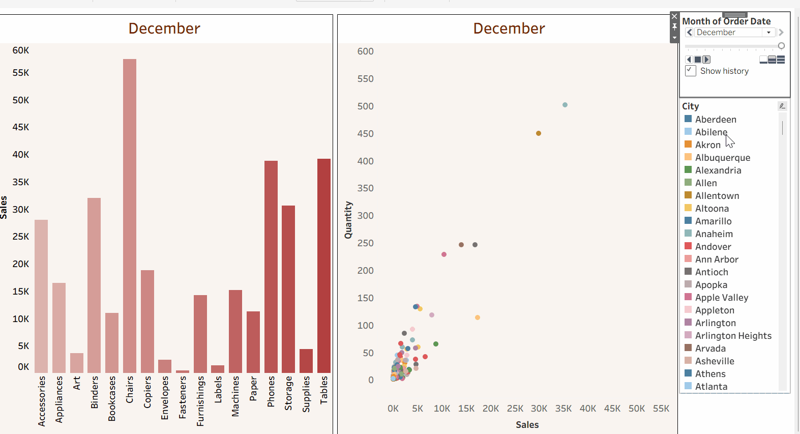
The final outcome of the animation is shown below👇
Thanks for supporting me.
Keep Learning!