Foundations First: Making Sense of Measures & Dimensions:
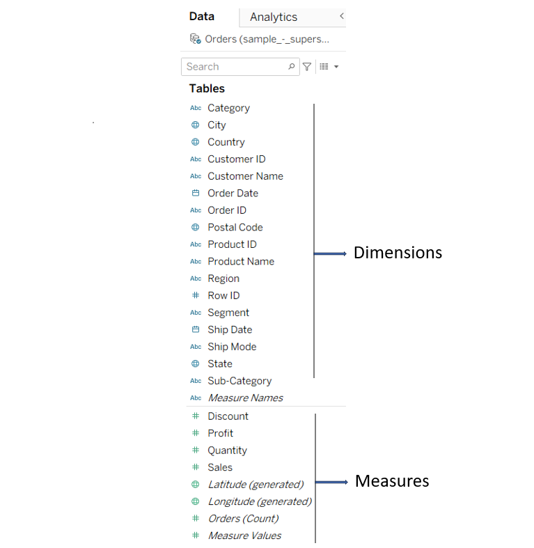
In Tableau, data is automatically categorized into Dimensions and Measures when you connect to a data source. You may have noticed they’re colored blue and green . Let’s break down what that means.
There are two types of data.
- Dimension: Tableau displays these fields in blue, indicating they are discrete. Dimensions are used to categorize data, and you generally don’t perform calculations on them. Examples include: Region, state, status etc.
- Measure: Tableau displays these fields in green color, and you can do calculations on them since they are continuous in nature. Examples include sales, profit, etc.
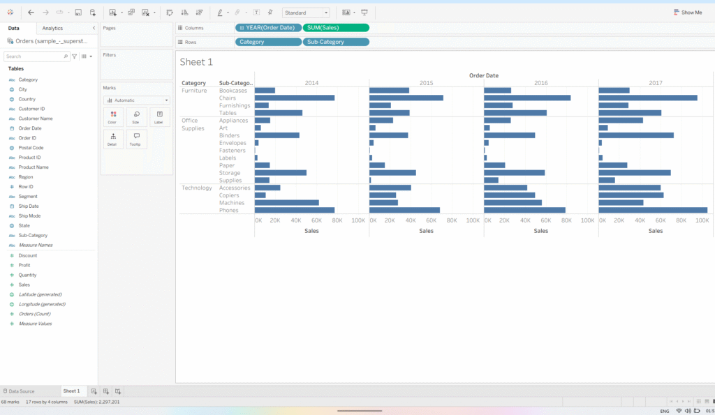
Let’s understand it with an example:
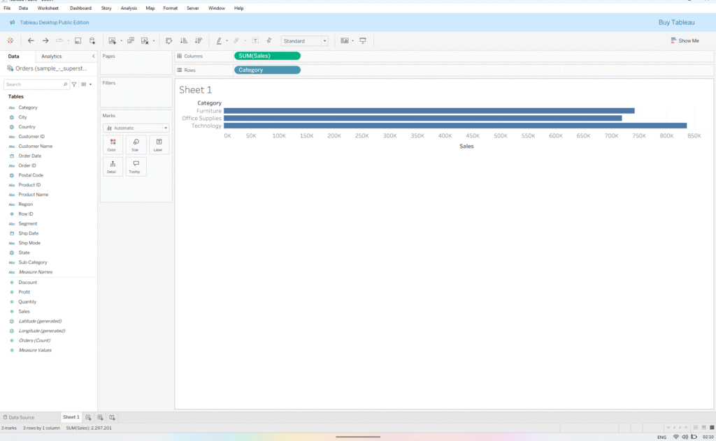
- Drag Sales to the Columns shelf and Category to the Rows shelf. You’ll notice the Sales pill turns green and the Category pill turns blue, indicating continuous and discrete fields, respectively.
- Now, add Sub-Category next to Category, and Order Date next to Sales in Columns shelf – the view is further divided by the added Dimensions.
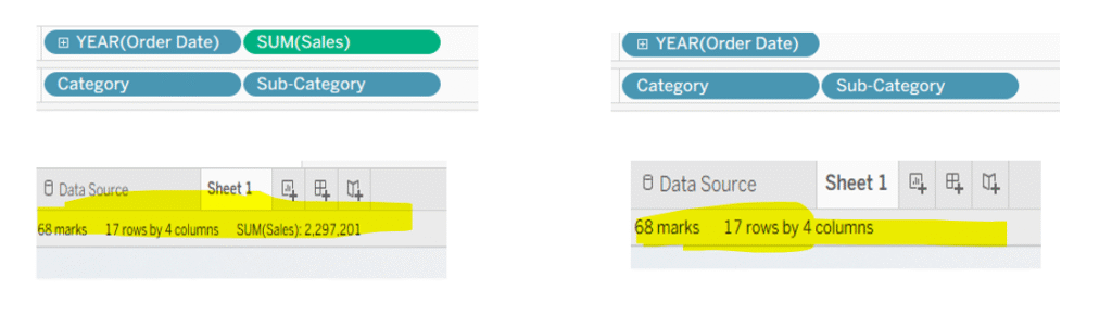
Notice, when I remove Sales from the view, there is no change in the number of marks (see bottom left corner). This is due to the placeholders created by dimensions in the view, which remain unaffected by the measures added or removed from the view.
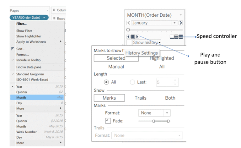
Bonus Point: You can convert measure into dimension. Watch this video

I hope, it helps.
Appreciate your visit.
Follow me on: