Dual axis in Tableau
A Dual Axis in Tableau lets you overlay two different measures – each with its own y-axis on the same chart. This is useful when comparing two different metrics such as Sales ($) and Profit Margin (%) over time.
Here we are going to combine Bar Chart (for sales) with Line Chart (for profit). Below are the steps to be taken to make it Dual Axis.
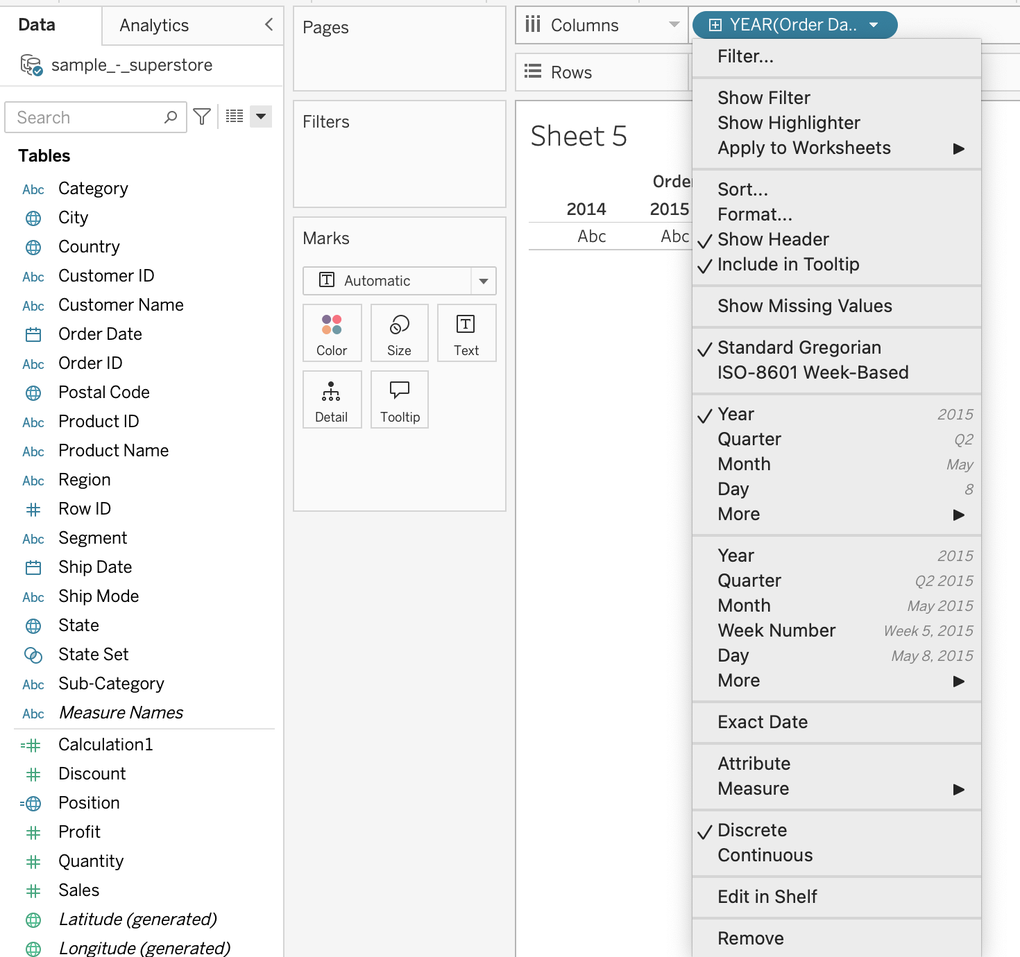
Step 1: Drag the Order Date from Data Pane to the Column Shelf,now go to the dropdown of Order Date and select Month.
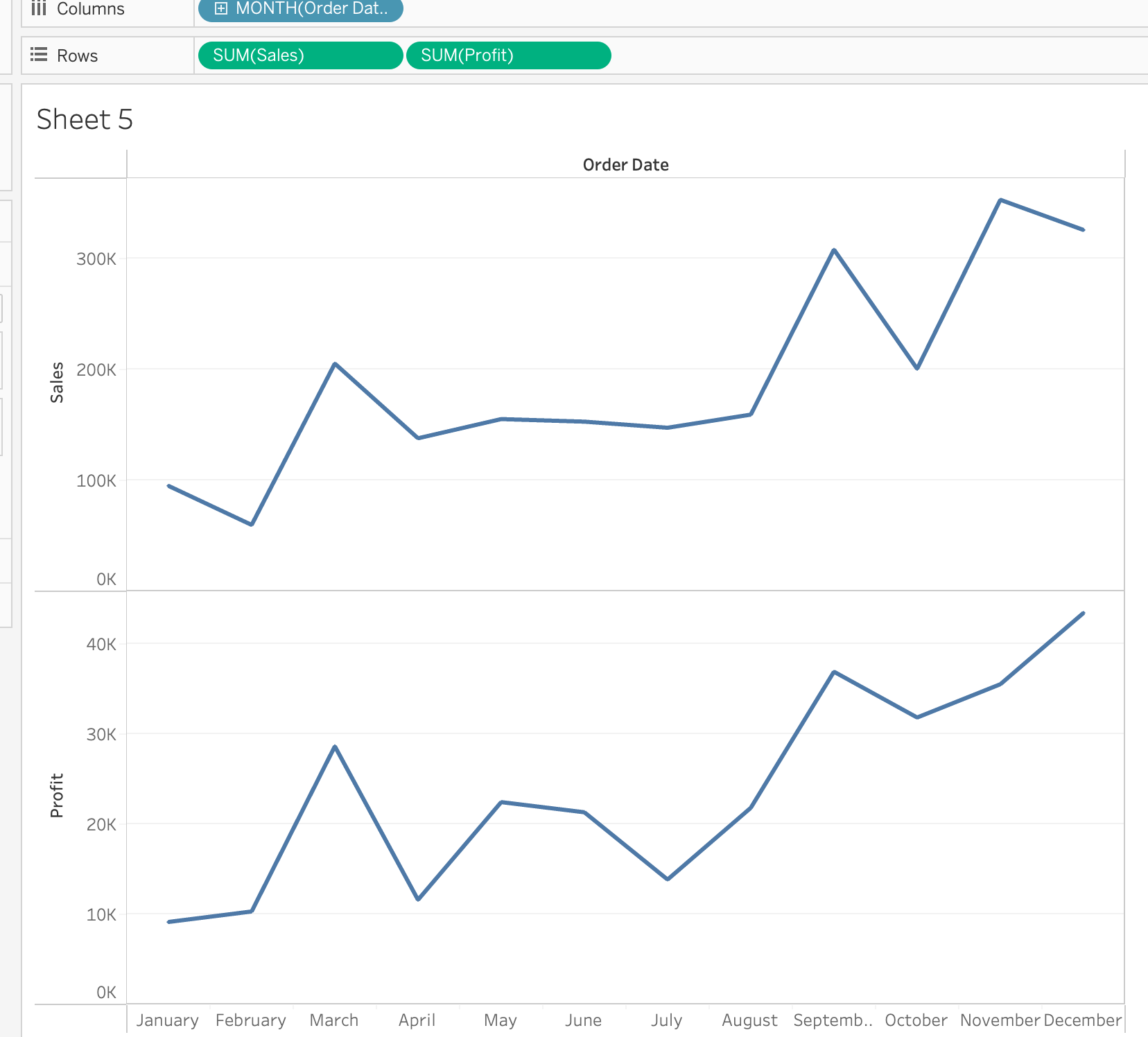
Step 2: Drag Sales and profit into the Rows shelf.
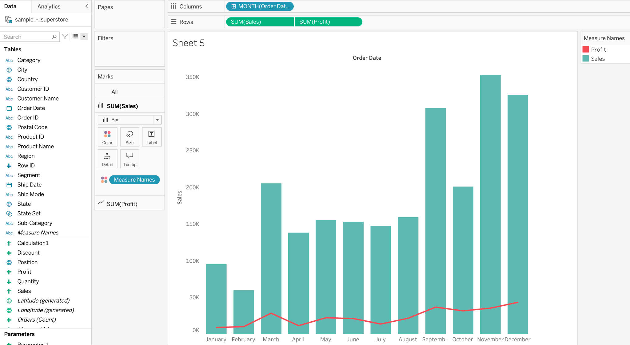
Now, your sheet should look like this.
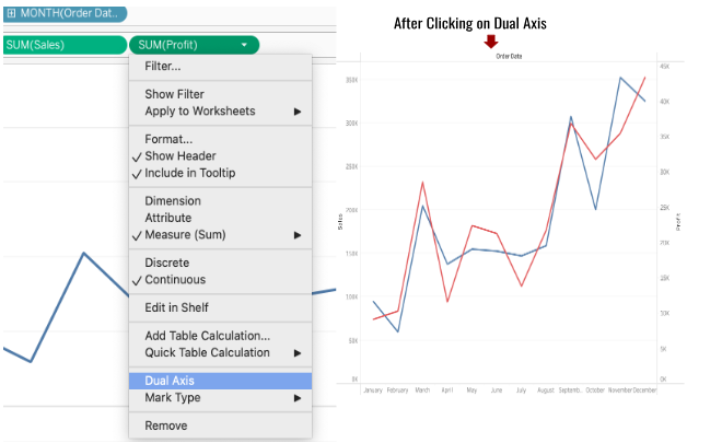
Step 3: Go to the dropdown of the second pill (Profit) and click on Dual Axis.
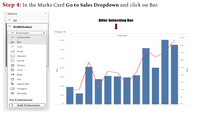
Step 4: In the Marks Card Go to Sales Dropdown and click on Bar.
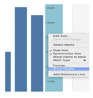
Step 5: At this stage Go to the Right hand side’s measurement and Right Click,you will see the option Synchronise Axis, click on it.
Step 6: Double-click on the right-hand side axis, then uncheck “Show Header”.
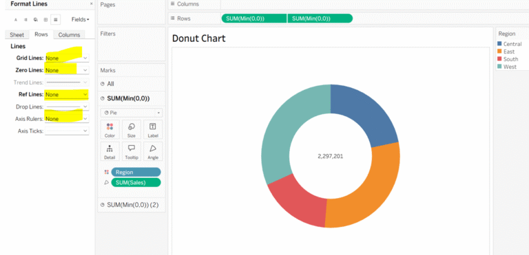
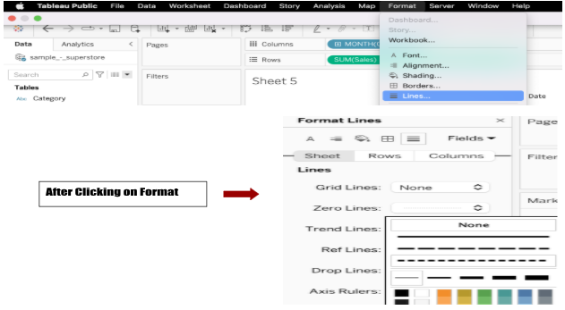
To format the chart further, go to the Format pane, under Lines, select “None” to remove grid lines.You can also change the bar color by clicking on the Color option in the Sales Marks card.

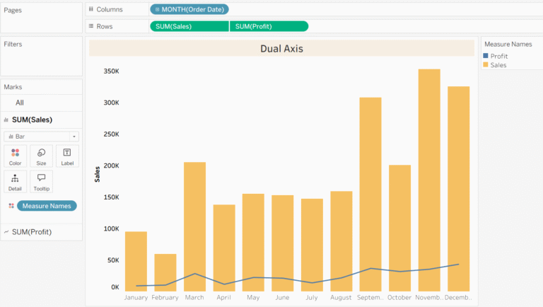
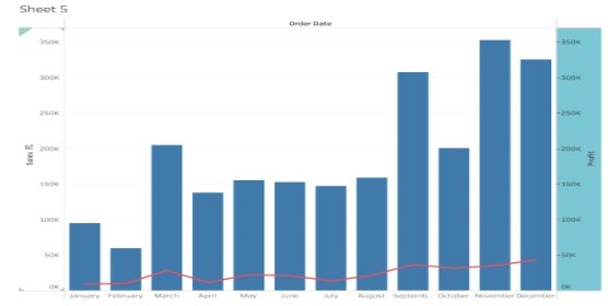
And here’s your final sheet – clean, dynamic, and insightful!
The dual-axis chart now clearly compares Sales and Profit, all in one powerful view.